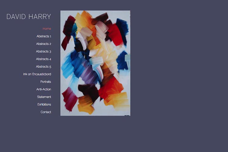
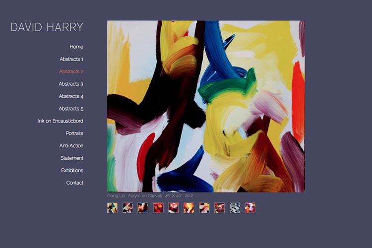
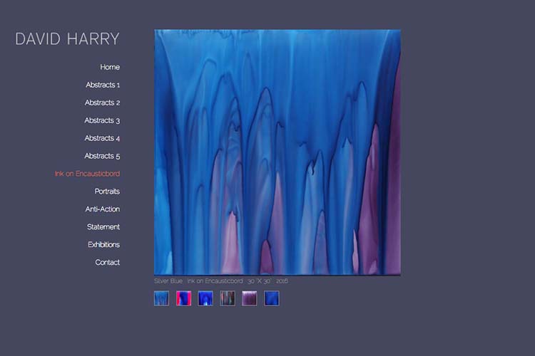
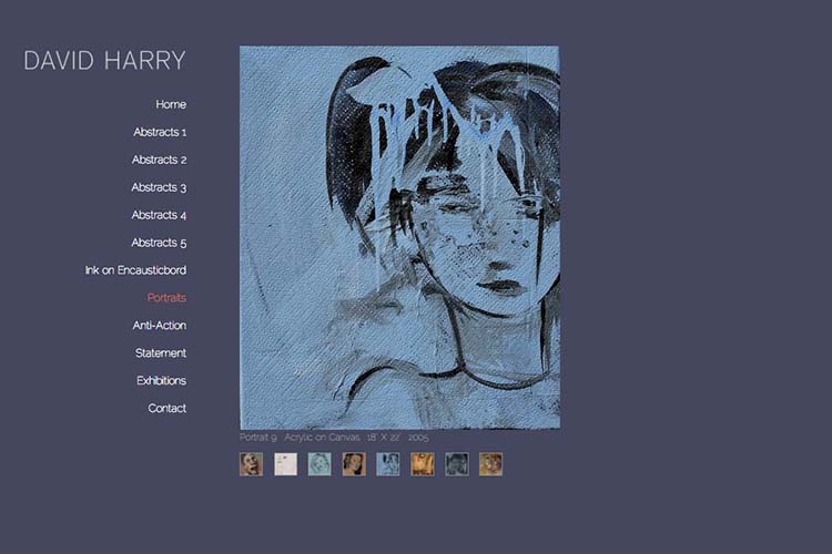
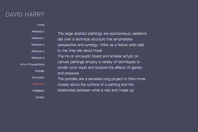
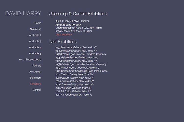
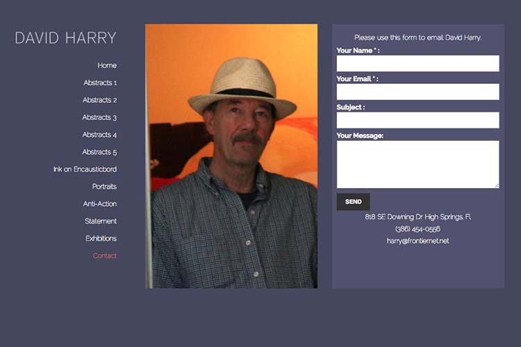
This artist requested a simple site with one main image per page and tiny thumbnails to allow navigation from image to image within each portfolio page.
This required setting up the page in a way that allowed for portfolios that could potentially have many images (requiring many thumbnails to fit in).
What we did in 2009 was place the navigation on the left with 400px-high main images on the right and thumbnails beneath the main image. This worked for the screen sizes in 2009 but needed a refresh by 2017 . We have now moved the site header also to the left—with 500px-high main images (and much-larger enlargements available via pop-ups) for desktops and also re-styled the site to be responsive for mobile devices.
The result is an easily-navigable website that works well for this artist, bringing good sales.
