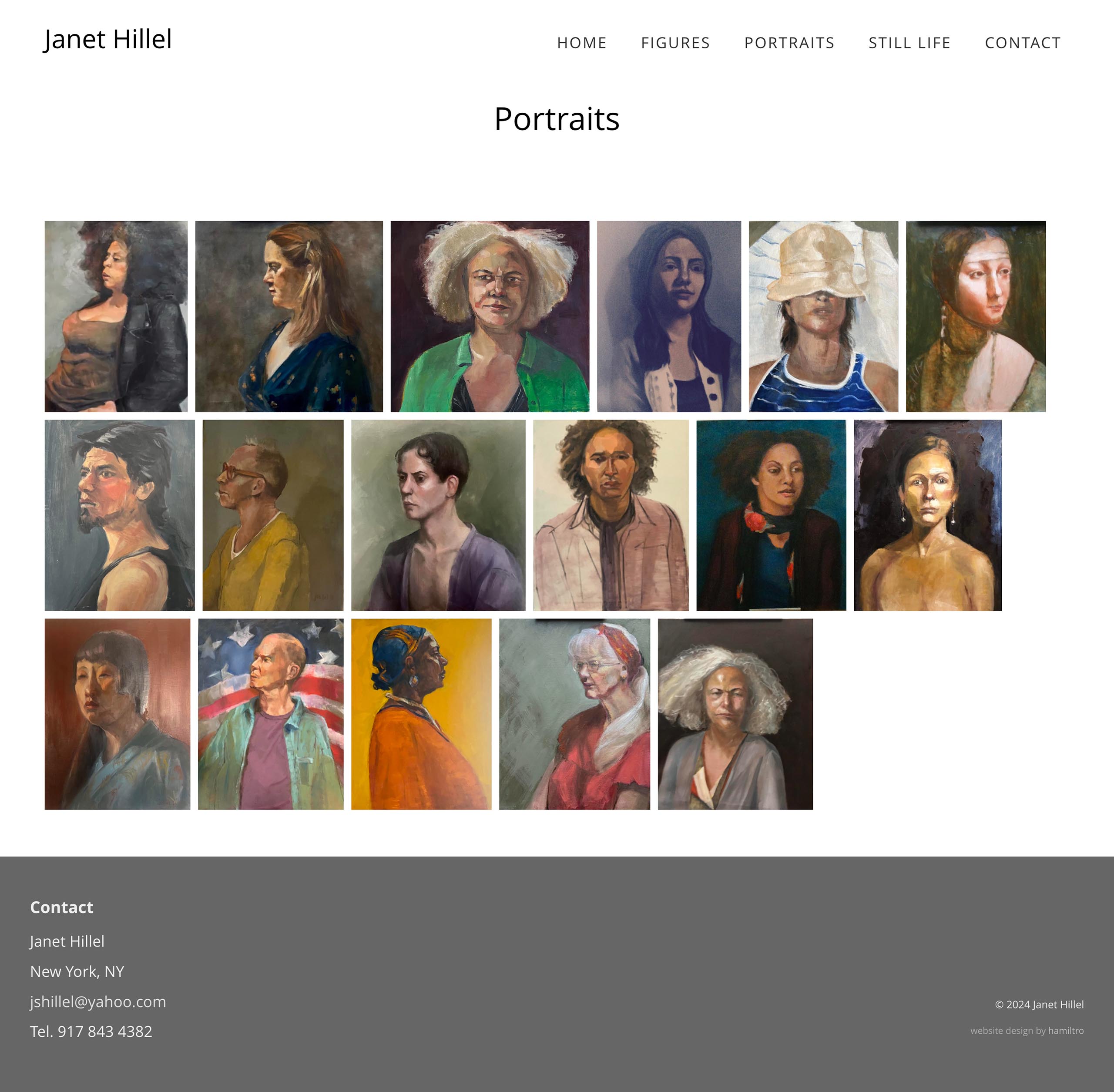
We designed this website for an artist who particularly liked the left-aligned layouts with ragged right edges. It’s a clean layout that allows for maximum use of space while preserving the ability to see paintings in their full proportions.

Here’s one of the index pages showing the thumbnails in a left-aligned array:

And here’s one of the single artwork pages—with navigation via pre/next arrows and also breadcrumbs. We create a unique record for every single artwork so that the website can be expanded to function as an artwork archive at any point.

Category: artists & galleries


