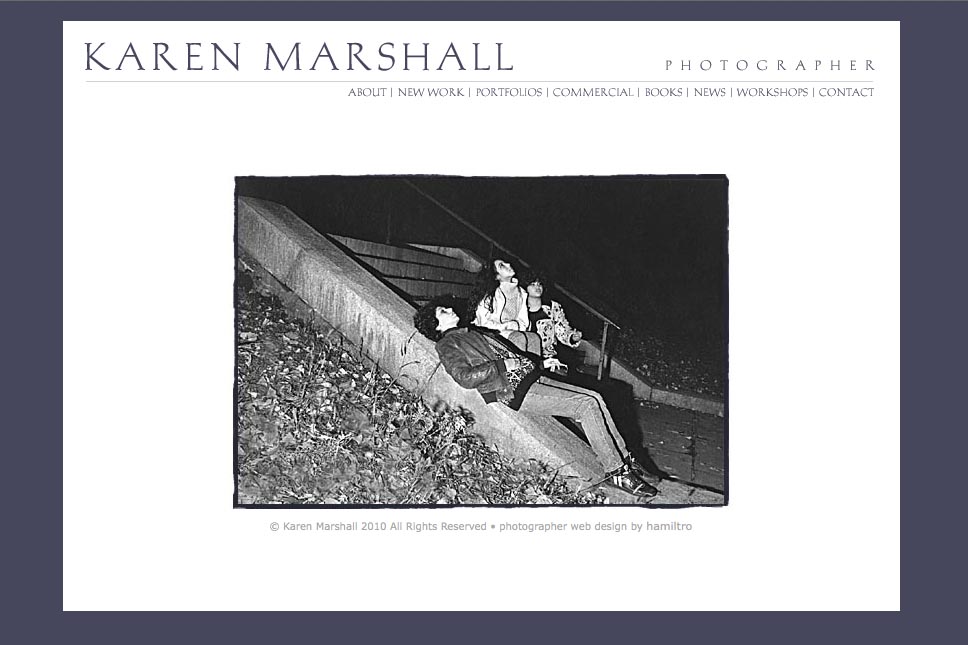
A very early photographer website (2005) that featured a rough-printed frame around each image and a detail-crop thumbnail for each photograph for navigation. The thumbnails were in a container with a custom-designed scroller, showing three at a time and maintaining their position in the portfolio as the visitor clicked each one (opening the large images in a new page with each click).


so you should know...because it is always great to hear good things....... the response from the photographers I have sent my site to...is really great....... they love the design!!!!!!!!! I have sent the site out to many photographer friends...so that they can look of course but also because they will also tell me if something is wrong as well. I have gotten rave reviews from many!!!!!!!!!!!!......'lots of pics but you never get caught anywhere...great design, clean, photo central etc......' So that is terrific and you should know this!!!!!!!!!!! my work is a lot about slow looking and some how the design helps this happen. It has been really interesting to hear people talk about my work via the site, the time they have spent looking...... It confirms to me the notion that if the design is right that there is an intimacy that one can attain on the web.....
Category: artists & galleries


