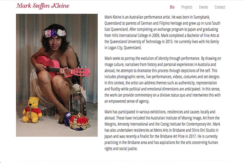
This young performance artist had been using a basic blog to present his portfolio of work. He wanted to have a more professional site and one that could be easily navigated between many projects with written descriptions.
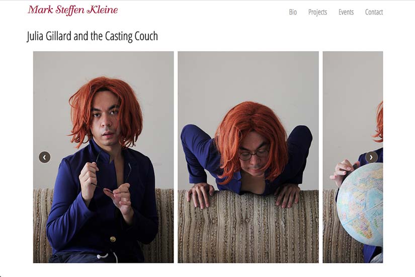
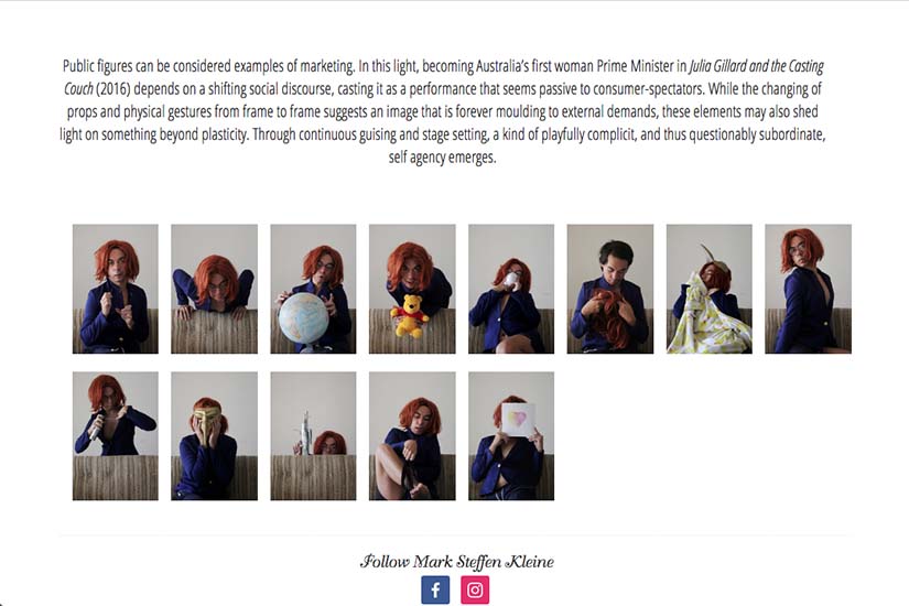
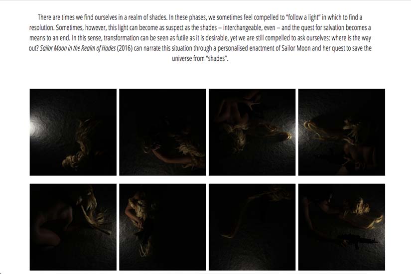
One challenge we met was that he had been creating one composite image of all the images from one of his projects (simulating an array of individual thumbnails); he had worked out different optimal sizes for the thumbnails for each project and wanted to be able to use individual thumbnails to create the same effect.
We coded his projects up with an option for him to choose the number of thumbnails to display per row such that the thumbnails would align to his preferences and also re-size responsively.
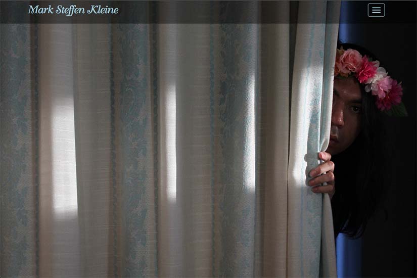
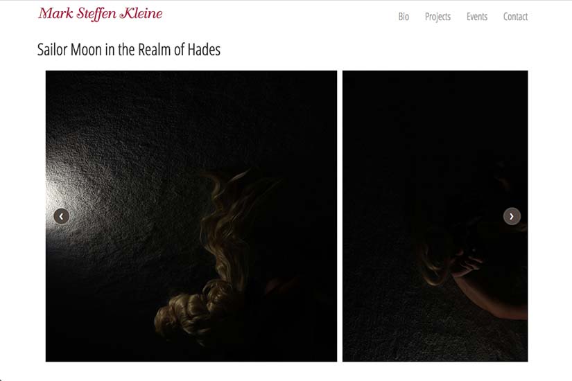
Throughout the site, visuals are big and dominant (including tiny thumbnails in the drop-down menus so it’s easy to choose which project you want to view). Texts are incorporated for every project so the whole experience provides an in-depth introduction to his art.
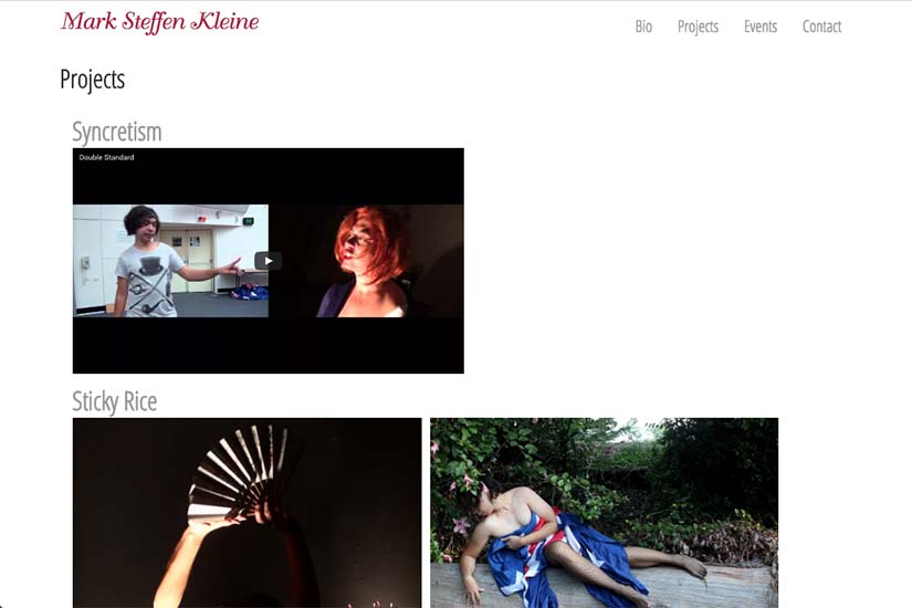

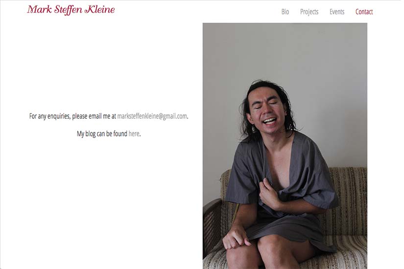
I'm so stoked with the website that Rohesia and her team created for my performance work. We were able to create something that was both simple and sensitive to my work's premise, and I didn't expect how happy I would be with the result. Rohesia was concise, sensitive and understanding of my needs through the whole process, especially during difficult periods when she made sure I came back on my feet. Specifically, the simple yet vivid navigation of the website, such as the icons and the layout of the Project Index page, deserves praise as it was the hardest to program. Thankyou Rohesia!! I look forward to working with you again in the future. xxx
Category: music, dance & theater


