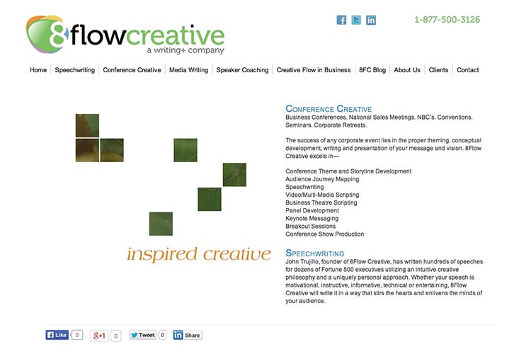
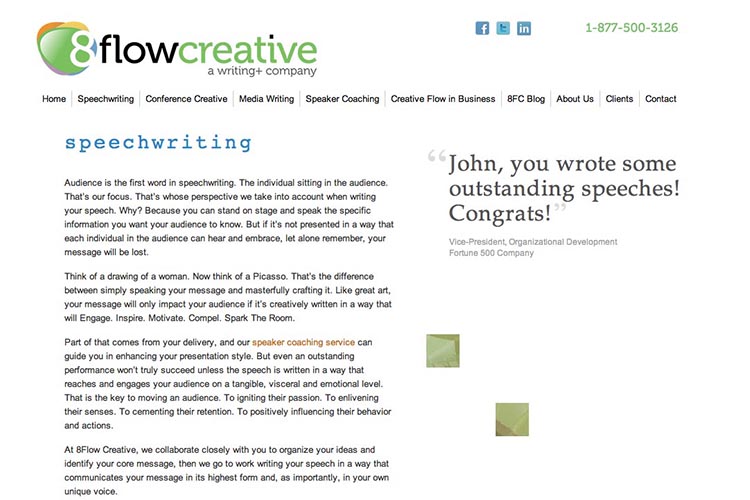
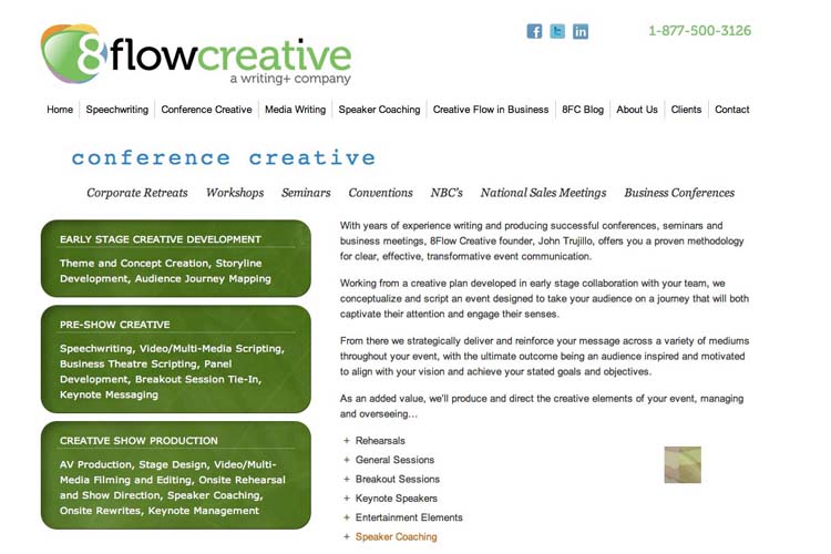
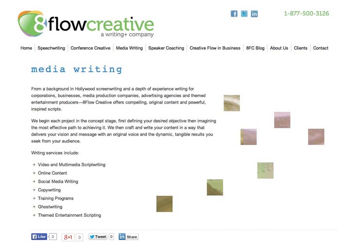
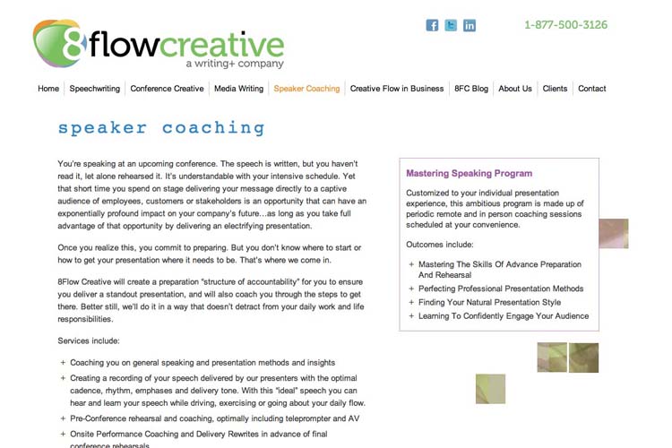
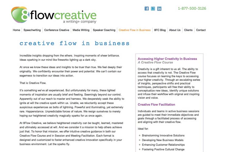
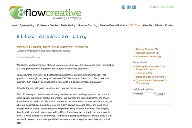
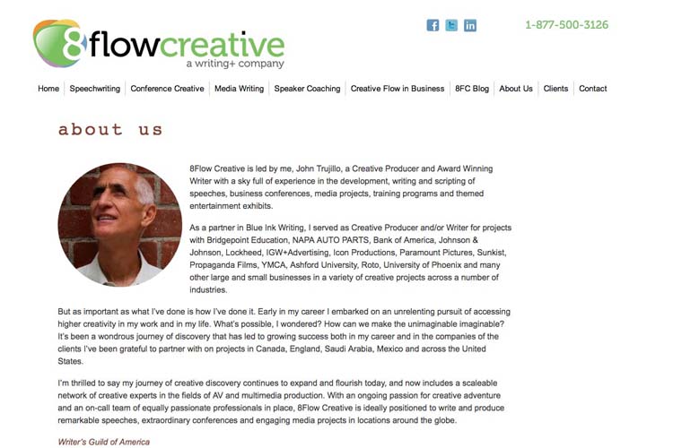
We designed this site for a speech-writing and public speaking coach and consultant. He wanted it to appeal to a target audience of business people while having “the visual grace of an artist’s site” and an emphasis on creativity—“an abstract, edgy, stark looking site that’s more visual than text (especially on the homepage).”
The challenge was to find the right balance for abstract visuals that were to be more than styled buttons, etc—bold enough to make a playfully creative statement without overshadowing the important texts.
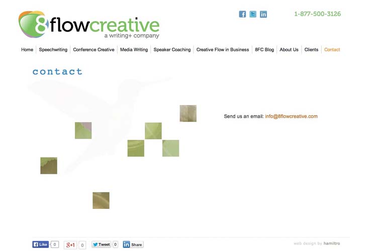
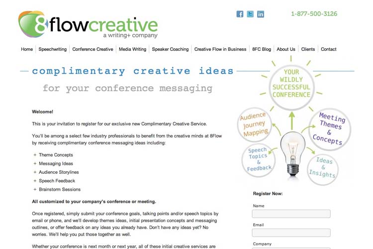
We started with the logo and set the color scheme from that. We then created a series of images with layered and colorized photos and then broke them up into grids from which we made a subtle slideshow for the homepage as well as continuing motifs throughout the site.
The result is a site which creates a light playful feeling on the homepage and which echoes that playfulness throughout the site—while allowing visitors to easily find their way around and read the texts.

Category: lawyers, consultants & agents


