This is a redesign for a writer for whom we designed a site in 2013. Her work had evolved and grown, as has the web and our expectations of a website.
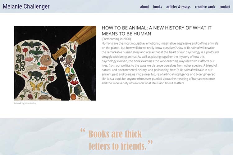
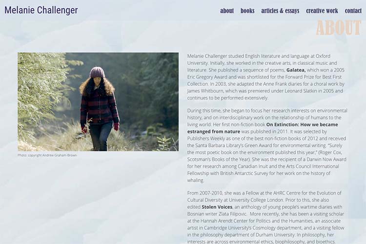
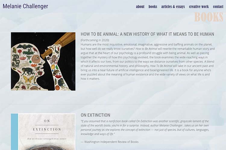
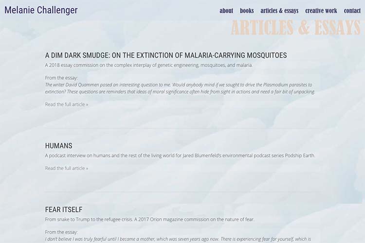
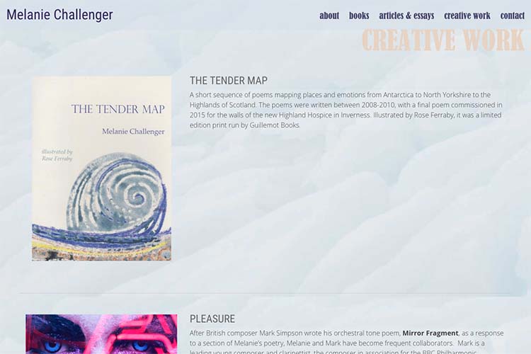
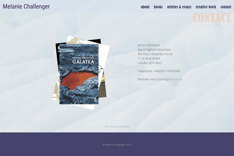
There are elements of the original site that we kept (the palette, the soft background image of ice; and the font for links, page-headers and the homepage quote) but the layout was redesigned to feature the most recent work more prominently and to allow for easier access to all the content.
The homepage is long with a short introduction to all the most important/current content and the index pages for each section follow a pattern of providing all or almost all the information in long-scrolling pages—so that a visitor’s need to click links before getting to content is minimized.
Category: authors


