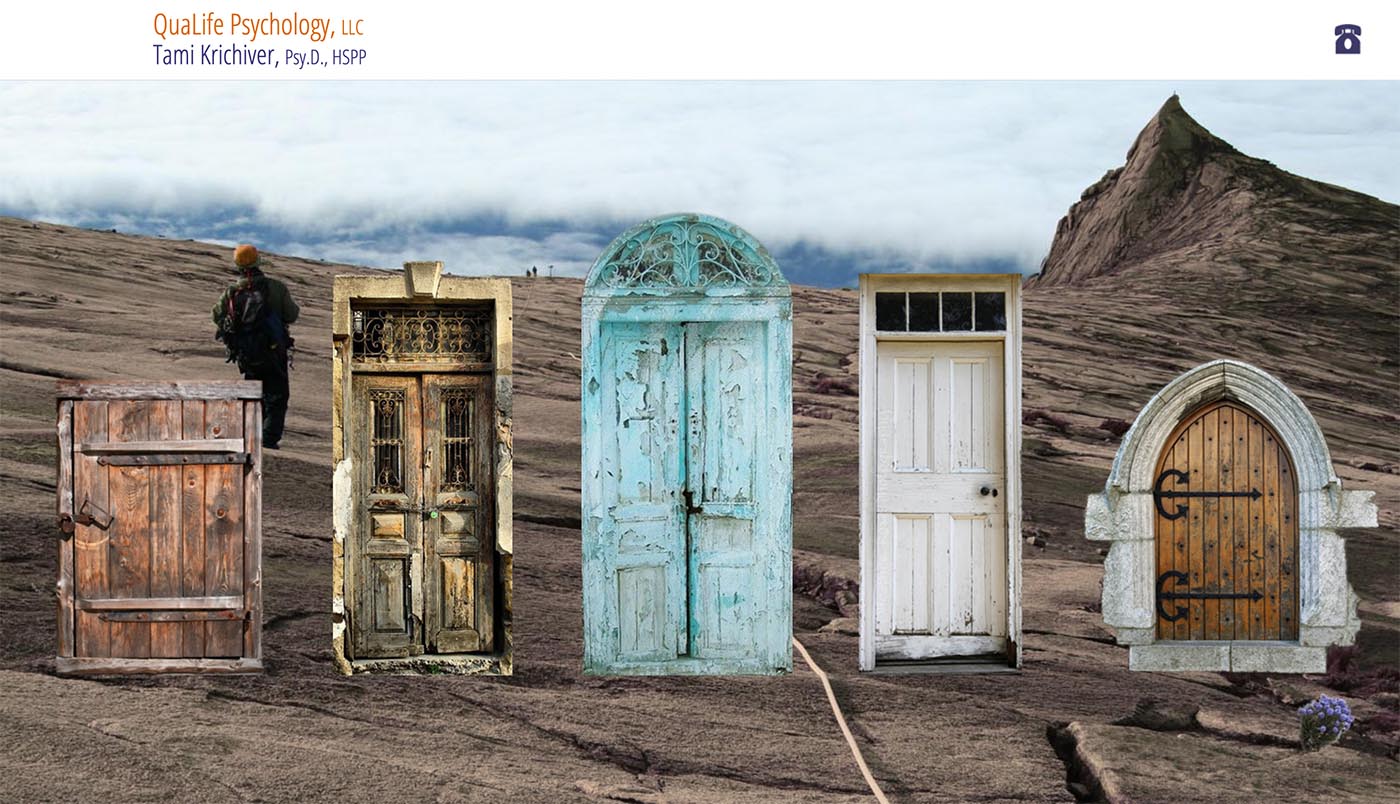
For the design for this therapist website, the client asked for something to suggest doing depth work, uncovering things; something with a sense of nature and something playful (even though, as she said, the work is “more like someone struggling up Mount Everest”).
The challenge was to find the balance between a bright, optimistic colorful look with the need to address the fact that therapy is hard work.
And so we tried these doors on a mountain, through which the visitor chooses his/her entry point. The sub-pages are more straightforward but repeat the playful door colors as the visitor hovers over the links.
The result is a site which very much starts with an invitation to take a first step while at the same time affirming the attainability of goals. The site’s informational pages are then simple and frictionless, encouraging a visitor to contact the therapist.

Each of the doors is a link to one of the subpages, per the next image:

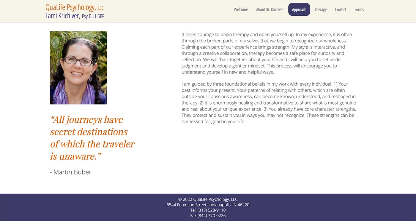
And then the subpages are simple and informative, while also reflecting the personality of the therapist:

Throughout this process, I have felt connected with you from a distance, and truly overwhelmed with gratitude that I reached out to you and you agreed to work with me. I had a feeling inside that I wanted translated on a website, but I didn't have any look in mind whatsoever. When we spoke over the phone, it felt absolutely right. So, it feels like an enormous gift to receive your artistry, spirit, and great skill in the work you delivered for me. I never really let go of feelings of gratitude, and I will always be grateful for what you've created for me!
Category: healthcare providers


